
About the app
msg.Check-In is a straightforward and easy-to-use progressive web application which empowers employees to decide for themselves when they want to come to the office by allowing them to check-in and occupy a seat, either alone or together with a team.
The application consists of the following main features:
Workplace management:
- The app has a database of all buildings / building equipment / floors / rooms / places (including maps) – 2D room and places map;
- The app has a database of all parking / parking equipment/floors / parking spaces (if the feature has been enabled by the System Admin);
- Building admins may enable/disable places in rooms (e.g. to ensure that there is enough distance between places due to Covid-19 concerns) but also parking spaces ;
- Building admins may specify the equipment in each workplace or parking space;
- Building admins are able to set the maximum check-in duration and maximum check-in date offset in the future (e.g. check-ins may be created only 14 days in the future);
- Building admins may choose to activate the Confirmation functionality on building/parking level, which will require the end user to validate his/her check-ins in order not to lose the booked workplace;
- Building admins can set a time zone to a building so that all the check-ins performed will consider a specific time zone. For already created buildings the default time zone is set to CET;
- Building admins may also extract an anonymized report regarding the seats that were occupied daily in their own building, in order to ensure that the facility managers have the proper information so that they can clean/disinfect those seats to keep the office space as safe as possible;
- Building admin may see different statistics on a building level which can help them take data-driven decisions regarding space allocation and usability (if the feature has been enabled by the System Admin).
Check-In functionality:
- Employees may mark a building as favorite, so that they can see first in the list of available buildings (the heart symbol on the right upper corner of the building card);
- Employees may check-in and occupy an available place in a room. Additionally, they can also reserve an available parking space, but only after the office check-in is successful (if the feature has been enabled by the System Admin);
- By selecting a place, the employees can see the standard and optional equipment available at that workplace for a better decision-making process;
- Employees can choose to check-in at the workplace on a daily basis;
- Employees can choose to create a check-in during day hours or during night hours;
- Employees may be required to validate their check-ins after 30 minutes from the start time of the booking in order not to lose the occupied workplace - only if the building admin enables the setting;
- They can use the "Book again" functionality for a quicker check-in process;
- Users can choose to set a default check-in time interval either from the "Check-In" Menu when they perform the first check-in or afterward by accessing the "My Profile" Section;
- Employees can see their future and past check-ins on Home Page and in their own calendar;
- Under Today's Activity each employee can see all his/her check-ins from today and make specific changes such as confirming the check-in (if the Confirmation functionality is enabled), adding parking spot (if the functionality was enabled), or simply deleting the check-ins;
- Users can edit a check-in, that is part of Today's Activity or of future check-ins, by changing its place or time interval.
- Employees can see the check-ins of the colleagues they follow but also the check-ins of their teammates by accessing the "Social Calendar" from the Community Tab (if the feature has been enabled by the System Admin);
- Additionally, on the Home Page the employees can see under the "Our Community" section all the people from their Following list and Team list which have a check-in for the present day;
- Employees have the possibility to create recurrent check-ins for office places. The amount of weeks for which a recurrent check-in can be created is defined by the building admin and might be between 1 and 4 weeks.
- Employees can restrict the visibility of their check-ins and choose if they want to share their information (photo and name) with others or not by accessing the Settings Menu and performing the corresponding action - Profile visibility;
- Employees can book a recreation or a cafeteria place (alone or with the team) if these have been enabled by the building administrator.
- Users with the role of Front Desk admin can create check-in for guests and therefore reserve places for people without an active employee user and account.
Community functionality:
- Employees may form “teams” and perform group check-ins – project teams or groups of interest;
- Employees are being notified (by e-mail and/or notification depending on the user's preferences) when someone wants to add them to a team. They then have the option to accept or reject the request;
- Employees have also the option to leave a team they are currently part of;
- Team members can view the status of the other team members on the "Community" Section of the app and check-in together with them, only after they approved the "add to team" request;
- Employees may “follow” other employees to see when they are coming to the office (e.g. such that lunch groups can come on the same days to the office);
- As a user, each employee has the option to accept or reject a “following” request. Additionally, the user is able to remove the previously confirmed followers at any point in time;
- Followers can view the status of the following colleagues in the "Community" Section of the app only after they approved their request;
- Users can always delete a sent following request or a colleague that is already in the Following list.
- Users with the role of Front Desk Admin can also create guest profiles which will form the user’s guest team. The Front Desk Admin will be able to create a team checkßin for his guests.
Reporting functionality:
- The role of a reporting admin can be assigned to specific employees empowered to have such a role;
- This role will ensure the possibility of having an overview of who and when was present at the office (in case of epidemiologic inquiry);
- Under the Statistics Tab (if functionality was enabled by the system administrator) the building and reporting administrator can see a series of graphics containing relevant statistical data regarding specific buildings which may help them make data-driven decision.
For the employees who first log into the msg.Check-In app, a "Welcome screen" will be displayed, and in the case, something changes, one or more screens depicting that will be displayed after login, as you can read below.
-
Welcome Screen - This screen informs users about the settings for their account such as enabling push/email notifications or profile visibility. In order to leave this screen and access the application, users must accept the terms and conditions first.
-
What's New Screen - The users will be informed every time changes appear in the application. The user can read the news and navigate between them using the little circles or the Next button. News can be ignored by pressing either the Skip button or the Continue to app button or by pressing the X icon at the top right of the dialog box.


Authentication
The authentication process depends on the configuration performed by your System Admin but regardless of this in order to enter the app each user will require to enter a valid username and password.
User Roles
The following roles are available within the application:
- User: has access to the main functionalities of the application, except for building management, reports or admin operations;
- Building admin: is specific to each building and has the right to edit, add, and delete photos, maps, and seats to his own building. Additionally, a building admin can extract an anonymous report about the check-ins for the current day and can also see the Reporting tab. In this new tab, a comprehensive overview of the occupancy of that specific building will be available. This functionality needs to be activated by your System administrator in order to be visible;
- Report admin: is specific to each building and has the right to extract the report regarding past check-ins. The period for which the check-ins are saved is configured by the Super-Admin;
- Allocation Admin: is responsible for allocating the places marked with the type "allocated" to specific employees, who benefit from their own places in the building;
- Front-Desk Admin: is responsible for creating guest profiles and check-ins for its guest team;
- Super-admin: full access to the application, gives the rights to the report admins and buildings admins, and can customize the Corporate Identity of the app;
User data synchronization
An automatic refresh of the login provider data is done for the user each time a login is successful. As a result of this synchronization process, the following data is cached in the application:
- Username;
- Full name;
- Email address (not visible for other users);
- Department (not visible for other users);
- Location (not visible for other users);
- Company (not visible for other users).
Home Page
The Home Screen of the msg.Check-In app offers useful information for the user regarding his/her current check-ins, previous and past check-ins, and about the current check-ins of his/her community:
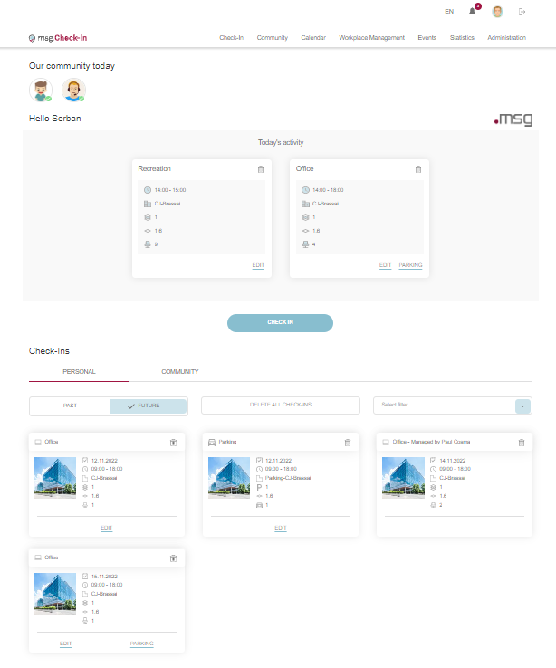
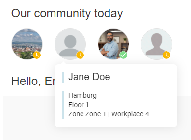
Our community today
The first section available is the one showing the check-ins of the user's community for the current day. On the lower right-hand side of the user's photo, a colored icon is displayed to inform if the user's check-in is confirmed (green) or not (yellow). By clicking on one entry the user can see the name and department of that colleague and the information regarding the place where he/she has the check-in for today.
Today's activity
Today’s activity section displays all the user's check-ins from the current day. In case of a single check-in, after clicking the card, the user navigates to My Calendar section where all the pieces of information regarding the selected check-in are displayed. In case of a team check-in, the navigation is done to the Social Calendar section, where the corresponding team is automatically selected.
If on a certain building, the admin has set the check-in confirmation functionality (for office and/or parking), then the user must validate his/her check-in in order not to lose the place. The validation process is done in this section by pressing the Confirm button displayed below each check-in. The Confirm button is neither visible for check-ins made in the cafeteria nor for check-ins made in the recreation room. If a check-in is not confirmed within 30 minutes after the chosen starting time, it is automatically invalidated, and the place becomes available. Users who have the notifications (push and/or e-mail) enabled will receive reminder messages to confirm their check-ins if they have not already done so.
At the end of the section, there is a quick action button that takes the user directly to the check-in process.

Personal Check-ins & Community Check-ins
Check-Ins section is organized into two tabs: Personal and Community.
Personal check-ins tab contains all the user’s single check-ins and the check-ins which were made by someone else for the user as part of a team check-in. The user can switch between their previous check-ins and future check-ins (by default, the future check-ins will be displayed).
The future check-in cards are displayed in chronological order, and by clicking them, the user navigates to My Calendar section, where the details about the selected check-ins are displayed. Each card has a delete button. Also, each workplace check-in entry has the option to create a new parking check-in by pressing the corresponding button (if this feature was activated by the System Administrator). Add parking button is not available for cafeteria/recreation check-ins or for the check-ins, which were made by someone else. The single check-in cards also contain the Edit button which allows the users to modify an existing check-in by changing the place, date and time.
By clicking on the Delete all check-ins button, the user has the possibility to delete all their future check-ins.
The previous check-in cards are displayed in reverse chronological order. These entries are displayed for view-only purposes, but there is a button attached to the cards for the check-ins which were made by the user, called Check-in again. By clicking it, if the same place is available for check-in for the next day for the same time interval and if the user doesn't have a check-in, the check-in is automatically created and displayed in the future check-ins section. Otherwise, the user will be informed about this fact, and he/she can choose to start the check-in process or cancel the action. This card is not displayed if the Administrator selected zero days as the time interval for which all the check-in information is being kept since no historical data is available.
Moreover, the user can filter their previous/future check-ins in accordance to the check-in type:

Community check-ins tab displays all the team check-ins created by the user and the check-ins created for the guest team. The user can switch between past and future check-ins and can filter their check-ins in this section as well.
The previous cards section is displayed for read-only purposes.

After clicking on a future check-in card, the user navigates to Social Calendar, having the corresponding team selected. Also, these cards contain a button called Manage Members. By clicking it, the user lands on a new page, where they can update the team check-in, by removing members from the check-in, adding members to the check-in, or even updating the place for some members. The user can't change the date/time of the check-in. All the changes will be applied after clicking on the Update Check-in button. In case the user changed their mind, they can click on the Cancel button.

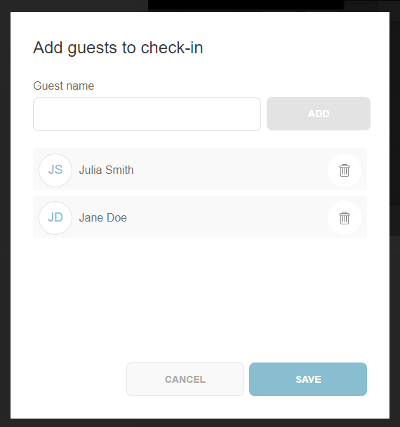
Moreover, if the user manages the members of a guest team check-in , they have the possibility to add guests directly from this page, by clicking on the Add members button. A popup will be displayed, in which the user can introduce the names of the guests they want to add. After clicking on the Save button, the members will be added at the beginning of the list, but also under the Guest Management section in the Community menu.
For the future check-ins which correspond to guest check-ins, the user has the possibility to add a parking check-in for this type of user as well, if this feature is available.
Check-In
The main functionality of the application is to allow users to perform check-in at the office. It is possible to do this by clicking the Check-In button on the Home page or directly by accessing the Check-In Page from the main menu.
First, the user must choose the desired building. A building can be marked as favorite by clicking on the heart symbol displayed in the upper right corner.

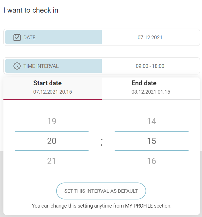
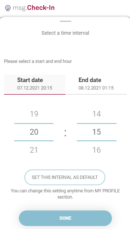
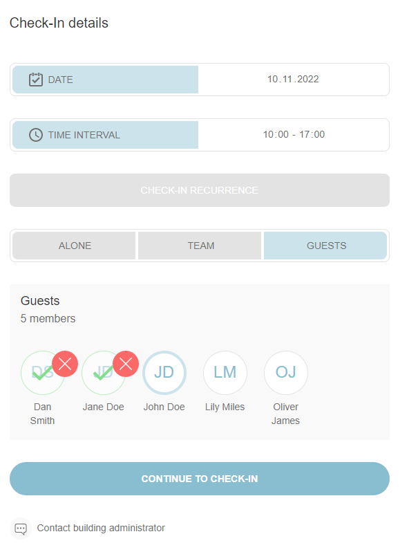
After this step, the user lands on a screen where they can set the details for the check-in. In order to create a check-in, a user must choose a day from the calendar. After choosing a day, the user can check in for the entire workday (8 hours) or choose a time interval. The user has the possibility to select the start time and the end time of the check-in by pressing the Time Interval button. In order to choose the desired time, the user must scroll up and down in the hours and minutes slots (on desktop, he/she can also click on the desired hour/minute). If the user chooses a time that is for the next day, the end date will be automatically updated. The chosen time interval can have a minimum duration of 1 minute and a maximum duration of 24 hours.
The selected time interval refers to the building's time zone (i.e. if the building is set in the Europe/Berlin time zone, then a check-in from 09:00 till 18:00 in that building will be created taking into this interval regardless of the time zone where the user is located).
When the user enters for the first time the application and goes to the check-in process and opens the time interval picker, the "Set this interval as default" button can be observed. This button remains there until the user clicks on it and saves a default time interval, after which it disappears. The user can also configure a preferred time interval for the check-ins or change an already saved time interval in the "My profile" section.
On mobile devices this information is displayed in a drawer:
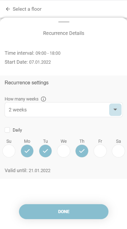
After selecting the time interval, the user has the possibility to prepare the settings for a recurrent check-in series, being able to book a place for multiple days or even a month in the future. By pressing the Make Recurrent button, a popup opens. Inside it, the user can select the number of weeks for recurrence, which depends on the date offset set by the building admin (default is one week and the maximum is 4 weeks), and select the weekdays in which they want to create the check-ins. The user is also able to see the date until which the recurrence is valid. After clicking on the Apply button, the Make Recurrent box will contain the recurrence period and a trash bin, which allows the user to delete the recurrence settings. The recurrent check-in series can be created only for single check-ins.
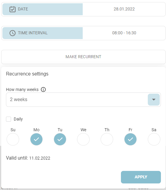
On mobile devices, the recurrence settings are displayed in a drawer:
If you can't see the "Recurrent" button, it's because the building admin has deactivated the Recurrent Check-in feature. This means that you won't be able to create recurrent bookings in that building anymore.
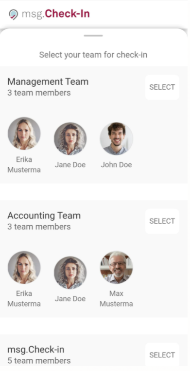
If the user does not want to create recurring check-ins, he/she has the option to perform the check-in either alone or as part of a team. If the user wishes to perform a group check-in, he/she can click on the Team button, next to the Alone button.
Selecting the team check-in involves choosing the type of check-in (office, recreation or cafeteria) and the team. If the user is part of multiple project teams, a drop-down list will enable him/her to view all the teams and select the desired one. After choosing the team, a list with all the team members from that particular team will be displayed, allowing the user to choose one colleague at a time in order to start the group check-in process.
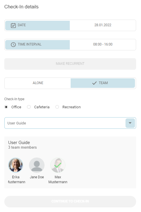
On mobile devices the team selection is displayed in a drawer:
In case the user has the role of Front Desk Admin, they will have the possibility to create check-ins for their guests. The flow is similar to the one associated with the team check-in. Meaning the administrator will see all the created members as part of its guest team and he/she will have the possibility to place one by one, each member, on the available green pins from the zone plan and then continue with the steps necessary for a check-in to be created.
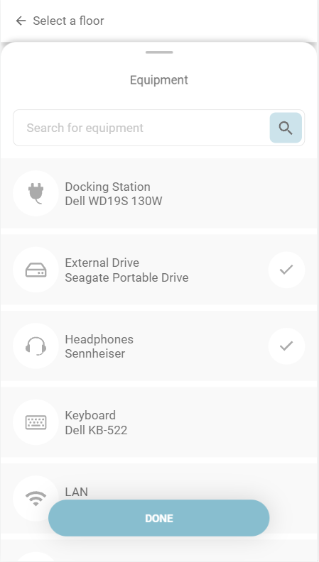
Moreover, the user has the possibility to filter the places based on a set of preferred equipment associated with that building. By clicking on the "Filter by equipment" button, he/she can select from one to all the existing equipment, and then he/she will be able to navigate only to those floors and zones in the building that has the selected equipment attached to the places. Moreover, in the modal, the user can search for a type or name of the equipment.

On mobile and tablet devices, the information is displayed in a drawer:
On the building level, if there is not any of the searched equipment on a floor, the floor is greyed out. On floor level, the zones which do not contain the searched equipment are greyed out. On zone level, the places which do not have the searched equipment attached are greyed out.
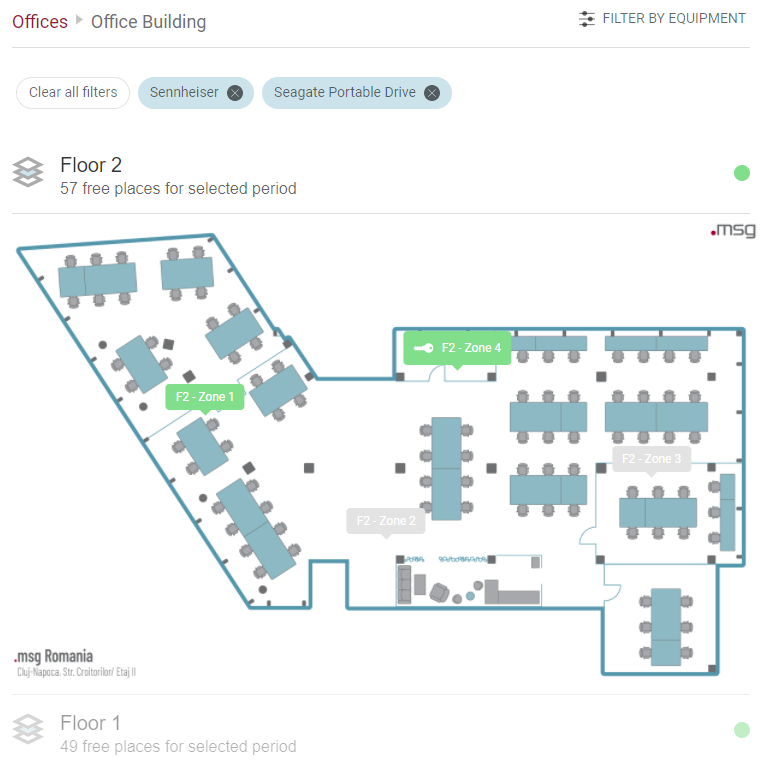
The chips with the selected equipment will be visible on each level of the browsing process to show the user the criteria by which the selection was made. The user has the possibility to clear all the filters by clicking on the "Clear all filters" button.
After selecting a floor and zone, the user can start clicking on the pins in order to choose a specific place. In an office building, there are three types of places: normal workplace in the office (laptop symbol), place in the cafeteria (coffee cup symbol) and place in the recreation room (gaming symbol). In addition, people with disabilities can have dedicated places marked with a wheelchair symbol.
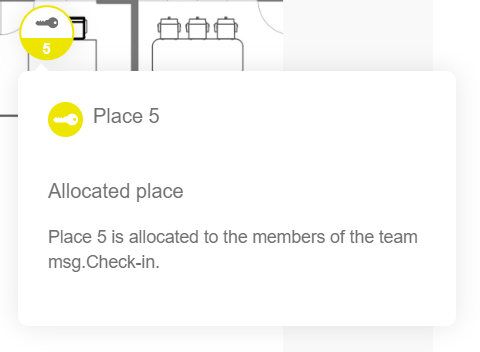
Some users have allocated places, which means that the allocation admin has set up a place exclusively for each of them. In this case, pressing the Check In button, either from the menu tabs or from the Home page, will redirect the user directly to the zone where he/she has an allocated place. The place is also preselected for the check-in; the user only needs to adjust the desired date and time interval. A user with an allocated place can change his/her place at any time by selecting another place on the zone map. He can also navigate to other buildings/floors/zones by selecting one of the links above the map in case of desktop version or by clicking the “Go to buildings” in case of mobile devices.
The allocated places are marked on the map with a key symbol to inform the users about this special type of place. In addition, allocated places also display a specific color assigned by the allocation admin to differentiate the seats dedicated to specific departments. If the place is allocated to someone, the user's avatar appears instead of the key symbol, to also mark the person to whom it was assigned (exception in this case are the private profiles where only the picture placeholder is being displayed). If the user selects an unallocated place or a place allocated to him/her, he/she can view the equipment available for it and proceed with the check-in process.

Additionally, a zone can be assigned to a specific team. Places within that zone that are allocated to the team are also marked with a key symbol. If a user is a member of the assigned team, they can select one of the allocated places and proceed with the check-in process. However, if the user is not part of the team, upon clicking on a place, they will encounter a popup message stating that the place is already assigned to the team "Name" as visible below:
Once the user decided on which place from the map he/she wants to check in, he/she can eventually select that place and click on the Continue to check-in button.

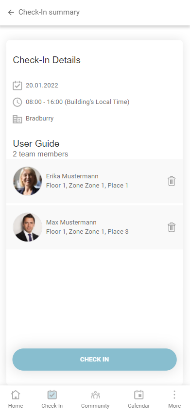
Before the final confirmation, the user can view the details of his/her check-in on a summary page. In case of team check-in, the user has the possibility to delete the previously selected colleagues. If the parking feature is available and the check-in is an office one, after pressing the Check In button a confirmation pop-up will appear asking the user if he/she wants to continue with creating a parking check-in. Otherwise, after pressing the Check In button, a success toaster will appear. The created check-in will be visible on the Home page under the Future Check-Ins tab and on the Calendar page, under the My Calendar tab.

In the case of recurrent check-ins, the user can see the selected time interval and the weekdays on which they want to create the recurrent series. After pressing the Check In button, if there are no recurrence issues, the success pop-up (the user will have the possibility to continue with recurrent parking)/toaster will appear here too. Otherwise, a new section will be present on the summary view, containing the recurrence issues, more exactly the seats which cannot be booked due to occupancy problems. During this step, the user has the possibility to change those seats by clicking the Change Places button, or he/she can ignore them by clicking on the Ignore All button.
If the user has already created some check-ins for the future that interfere with the recurrent series, in the Check-In summary view, he/she will be able to see a new section called Already created check-ins, containing a list of check-ins with their dates and booked places.

If the user clicks the Ignore All button, the success pop-up/toaster will appear.
If the user clicks on the Change Places button, he/she can navigate through the issues and can solve them by ignoring them or by choosing another seat.

After solving all the issues, the user will be able to see the changed places and the ignored issues on the summary view and the Check In button will become active. By pressing it, the success pop-up/toaster will appear.
The user will be able to see his/her recurrent check-ins in the Future Check-Ins section and in the My Calendar tab.
An additional feature is the Parking Check-In. This feature is available if your Administrator enables it. The Parking space booking flow is similar to the check-in flow and follows the same rules. A difference is that the Team check-in option is not available for the parking check-in. In case the user has the Front-Desk Admin role he/she can also proceed with the creation of parking check-ins. The Front Desk Admin can use the special type parking spaces marked as "guest" places in order to create parking check-ins for the externals or he/she can use the normal parking places which are available for all employees. Employees can only book the normal parking places but the guests can be checked-in on both types of places.
A parking check-in is confirmed if the associated workplace is confirmed by the user. All parking cards from Today's Activity section will not contain the "Confirm" button as they cannot be confirmed separately from the associated office place.

If a user is already checked in for the selected date and time interval, when clicking on a different place, the pop-up for entering the edit check-in flow will be displayed:

After clicking on Edit, the user will be navigated to the edit flow. This flow is very similar to the check-in one, except it allows the user only to modify a check-in's date, time interval or place.

When clicking on "View Changes", a summary as described above is displayed, stating the changes user made to the existing check-in. By clicking "Save Changes", the check-in will be updated and its new information will be displayed in the application.

Mark a zone as favorite
Within the check-in process, while in the map view of a specific zone, you have the option to designate it as a favorite. By choosing a zone as a favorite, you streamline the check-in experience, automatically directing you to that specific zone and bypassing the need to manually select the building, floor, and zone during the check-in process. The designated favorite zone will also be conveniently displayed in the "Manage Profile" section. To remove a favorite zone, you can either utilize the designated button on the map view or employ the "trash" icon within the "Manage Profile" section.


Check in using a QR code
Simplify your office check-in procedure with the efficient QR code scanning feature. If the feature is enabled by the building admin users can now effortlessly check in at the office by scanning a QR code conveniently positioned on a desk. This feature has been designed to streamline the check-in process, providing a seamless and enhanced user experience.
Here's an illustration of a place sticker:
The process is as straightforward as capturing the QR code with your smartphone's camera. This immediately guides you through the check-in process, where essential details are already pre-filled for your convenience. The designated location is selected, and the check-in time interval is automatically set to commence with the upcoming hour closest to the present time. Additionally, the check-out time aligns with your default end time based on your present set-up intervals in the settings menu.
If the selected location is unavailable for check-in due to factors such as occupation by another colleague, allocation to a different individual, removal from the app by the building administrator, or other reasons, users will encounter a popup. This popup will provide information about the exception and guide users on the appropriate steps to take next.
Community
The Community page is organized into three tabs: Followings, Followers, and Teams.
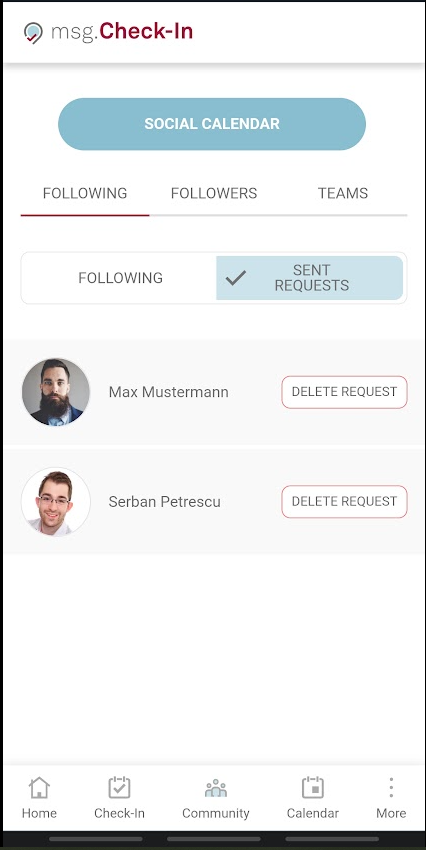
Following
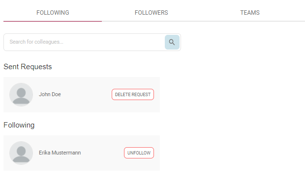
To Follow a co-worker, go to the Community page, the Following Tab, and start searching the person you want to follow, and press the Follow button. This action will trigger a request that is being sent to the colleague. The respective colleague will be notified of this action and has then the option to approve or decline the following request.

All the pending requests are being displayed under the section Sent Requests and will remain there until the recipient makes an action. If the recipient accepts the follow request, then the card with that user's name will be visible under the section Following. If the recipient declines the follow request, then the sender will be notified of this action and the card with that request will disappear from the Sent Requests list.
On mobile devices the two lists are being separated into two different tabs with the same names. In order to have access to the desired information you need to choose one of the tabs: Following and Sent Requests.
By accepting your follow request, your colleagues will give you access to see their activity and status within the app. More exactly you may see their daily check-ins and you may find their future plannings by accessing the Social Calendar. Also, in case your colleagues have a private profile, once they become part of your following list, their profile will no longer be private for you.
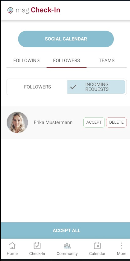
Followers
The Followers Tab from the Community page displays all the users that are currently following you but also shows all the available incoming requests. For the incoming requests, you will have the option to accept or reject the request. Based on the notification settings under your profile you are being notified via email and/or push about all incoming requests. In case there are more available incoming requests you may also have the option to accept all of them by clicking on the Accept All button. The pending requests are displayed under the Incoming requests section. Once a request is being accepted, that user becomes now part of the Followers list.
The user is also able to remove the previously confirmed followers by clicking on the Remove button next to the corresponding photo. Once a user is being removed from the list, that colleague is also being notified of your action.

Same as for the previous section, on mobile devices the Followers menu is also being divided into two different tabs, making a fine cut between the pending incoming follow request and the list with all your followers.
After accepting a follower request from one of your colleagues, if that user is not yet part of your following list then a "Follow back" button will appear on the user's card. By pressing the follow back button, a follow request of that user is being triggered. Once the button is clicked, it disappears and the following request and notification about this action is being sent to the user. In order to see it, you can go back on the Following tab and see the request under Sent Requests.

Teams
Under the Teams tab of the Community page all your teams are being displayed. There can be either teams created by you (Edit and Delete options are enabled), or teams in which you were added by other colleagues (Leave team option available). There is also the option to create a new team by simply pressing the + Create Team button.

Create a team
The Create Team button opens up the team creation view in which the following information can be added: Team Name and Team Members. Team Name must be unique in the application. In case there is another team available with the same name the new added team cannot be saved. In order to add members to the team, the colleagues' names must be typed in the search field and the Add button must be pressed.

Upon saving the team is being created and displayed under the Teams tab. The new added members will now have the status pending marked by the text "Pending members" and by the yellow clock symbol attached to each user picture. They will remain pending team members, meaning that they are not yet part of the team, until they accept the request to join the team. Once the request is being accepted, they will no longer have the status pending and they can now be checked in during the team check-in process. As long as they remain with the status pending, their name will not be available when creating a team check-in. If the invitation is declined, then the user is removed from the team and his information is no longer visible.

In any newly formed team, there is always a designated team owner who holds the authority to modify or delete the team. As the owner, you have the flexibility to alter the ownership, make edits, or completely remove it, as described in the following details:
Change Owner
As the team owner, you have the ability to transfer ownership to one of your colleagues, ensuring that the team remains active and has an administrator even if you step down. This option is available only for existing team members and cannot be assigned to pending members.
Once the ownership is successfully transferred, the selected colleague will receive a notification regarding the change, and you will relinquish your administrative rights over the team.
To initiate this action, simply click the "Change Owner" button and choose another active member from the provided list.

Edit a Team
When editing a team, the following operations are available: adding new members, removing members, and edit team name:

When adding a new user to a team, this member is notified of this action. The added member has then the option to approve or decline this association.
By pressing the Delete button assigned to each team member, this member will be removed from the team, and he/she will be notified of this action.
Once all changes are being done, the Save button can be pressed and the team information is being updated.
Delete a Team
To delete an entire team, the Delete Team button corresponding to the team should be used. This option is available only for the teams created by the logged-in user. After confirming this option, the team is completely removed from the system and all users who accepted the request to join that team are now being notified of the deletion.

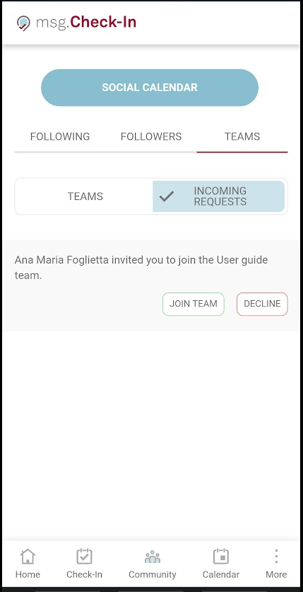
Incoming Team Requests
All available incoming team requests are displayed in the upper section of the page containing two action buttons: Join Team and Decline.

By accepting to join the team that team will become part of your teams lists.
On mobile devices there is also a separation on two tabs between the active available Teams, and the Incoming Requests:
On all mobile devices, on the Community section a shortcut button to the Social Calendar is being visible. By pressing that button, you land directly on the menu Calendar - Social Calendar where all the information about your community can be checked.
Guest management
In case the user has the role of Front Desk Admin, they will see a new tab called Guest Management. Under this section, the user can add guests by typing their full names in the input field and clicking on the Add button. Also, the user can search after a guest's name or delete an entry as well. All the added guests will form the user’s guest team. In case the Front Desk Admin adds new guests during the Manage Members process of an already created check-in, their names will be visible under this section as well.
Behind these entries, there is no active e-mail address associated. It is the responsibility of the Front Desk Admin to notify the users in case a check-in was created on their behalf.

Calendar
The user can access the Calendar page either by clicking on a check-in card from the Home page or directly from the main menu. The page has two tabs, the Social calendar, and the Personal calendar one.
Personal Calendar
On the Personal Calendar tab, all check-ins for the logged-in user are displayed. There are two views, a week view with all the check-ins from a certain week and a day view.

On mobile, the week and the day views are displayed using a drawer, which permits switching from one month to another by swiping left/right. In case of the week view, when the user selects a day, the whole week will be selected and coloured.
Once you select a check-in, you can view the check-in details and a detailed map. To identify who is sitting next to you, simply hover your cursor over the profile picture of your colleague on the map. On mobile or tablet devices, you can tap on the profile picture to view the same information. A pop-up window will appear, displaying the name and position of the colleague in question. This feature allows you to quickly locate and connect with your colleagues, making it easier to collaborate and build relationships with your team.

It is also possible to delete and edit (in case of single check-in) the selected check-in or to add a parking check-in. Also, in case the user is the owner of a team check-in, they have the possibility to update that check-in by managing the team members. During the manage members flow an already checked-in user can be removed from that check-in or a free user can be added to that existing booking.
Moreover, the user has the possibility to create a check-in directly from their Calendar for a day in the future in which there are no check-ins available. By clicking on the plus button (+) (week view)/Check In button (day view), the user will land on the Check-In Tab and after choosing a building, the date picker will already contain the selected date from the calendar.

Social Calendar
An additional feature is the Social Calendar. If this feature is enabled by your System Administrator the calendar card will have two tabs available, one with the user's own check-ins and the second one with his colleagues' check-ins. By default, the user will see the check-ins of the colleagues that he/she is following, but this can be changed in order to display check-in information about the colleagues from his/her teams or the check-ins made for his/her guests (if the user is a Front Desk Admin). The user can also search for a certain colleague and switch between day or week view.
The Team Owner is marked for each team and displayed in the Social Calendar on the first position.

To access further details about a check-in, the user needs to click on it, which will open up a new view containing a map of the selected location. The map allows the user to easily identify who is sitting in the same room by hovering over the profile pictures of their colleagues, which functions similarly to the "Personal Calendar" section.

From this view, a user can choose a location to create a check-in next to a colleague by selecting the desired place. A confirmation pop-up will appear once the pin is clicked. By clicking the Check In button, the registration is created and the user will be directed to their Personal calendar.

If the user already has a conflicting check-in for the selected date and time, the pop-up will prompt them to edit their check-in. If the user selects "Edit" they will be taken to the edit flow so that the updates can be done.
In case a user chooses to search for a specific number of colleagues and not go with the predefined settings of seeing the followed colleague or the ones that are part of his/her team, he/she can then always choose to come back to the default functionality by clicking the "Clear All" button which deletes all the selected users from the search list.
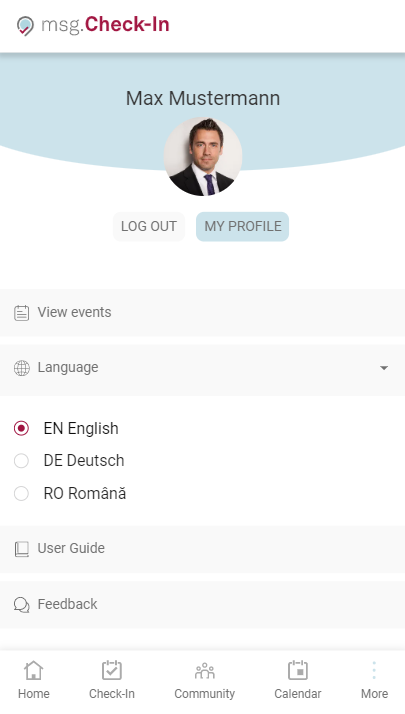
User Settings and Profile Management
User settings and profile management are aggregated together under the My profile page. Depending on the device that is used, this page can be accessed either from the menu bar -> profile photo on the desktop or from More Menu -> My Profile button on mobile devices.
The Manage Profile and Settings sections are immediately accessible to the user once entering the My Profile page.
Settings
This section gives the user access to the following settings:
Install the application on the Home screen
With this setting, the user has the option to add this application to his/her home screen on a mobile device and start it as any regular native app on the phone or to add it as a shortcut on the desktop (behaviour can depend on the user preferred browser).
There are also other options to do this setting:
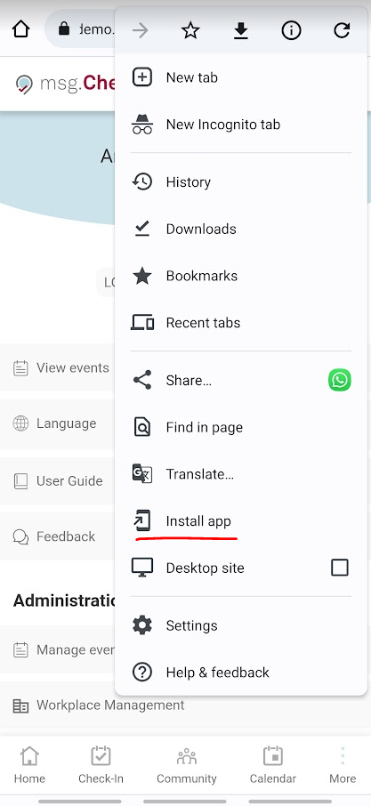
- Android devices:
When using Chrome the user has the option to install the app from the above Menu bar ( 3 vertical dots) -> and click on Install app:
- IOS devices:
For Safari, the user needs to click on the Share button from the browser -> Add to Home Screen. In order to do this from IOS devices, the application should be opened with Safari and not with Chrome or other browsers.


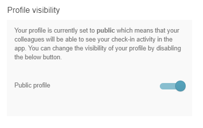
Profile Visibility
With this setting, the user is able to restrict the visibility of his/her check-ins to the other colleagues from the company.
By making the profile private will mean that:
- On the check-in screens (floor plans), the photo and name are not displayed. Instead, an anonymized icon is shown to indicate that the place is not available anymore. Followers and team members can still see your photo, name, and check-in status (confirmed – green dot /not confirmed – yellow dot) because they are part of your community and by accepting their requests you gave them permission to see your check-in activity;
- Team members can still create check-in together with the user, even if his/her profile is set to be private;
- Uses with special roles, such as super-administrator, building, and allocation administrator, will always be able to see all profiles even if they are on private mode as they need further information in order to do the job done.
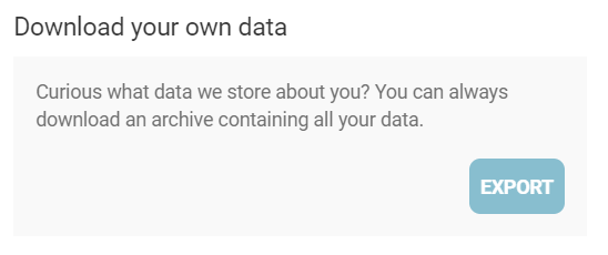
Data Export
Users have the possibility to download an archive containing all the data about them which is stored in the application.
Notifications
With this feature, users can choose to receive email or push notifications for specific categories. To manage your notifications, go to your account settings and select the notification category you want to enable or disable.
Check-Ins:
Under this section the user has the option to enable or disable the following notifications:
- Personal check-ins: includes all check-ins created by the current user (office, cafeteria, recreation, etc)
- Community check-ins: includes updates about new team check-ins but also updates made by the team members to those check-ins, including the deletion of check-in by one of the colleagues
- Parking places updates: in case this notification is enabled, you will receive updates when a parking space becomes available for the next working day. To receive these updates, the location of the parking building must be the same as the location in your user profile
- Updates from team members: you will receive updates about cancellations of your team members' check-ins if you have this notification enabled
- Check-in confirmation: when check-in confirmation is required a reminder notification will be sent prior to the automatic invalidation of the check-in
- Updates about place allocation: includes updates about new place allocation and place allocation removal
- Deletion of check-ins: includes deletion in case of a change of the building layout done by the building administrator, new event announcement, or direct deletion by the building administrator

Community:
In this section, you can choose to enable or disable notifications for follow updates and team updates.
- Follow updates: if you have this notification enabled, you will receive updates about new follow requests, unfollow requests, acceptance or deletion of follow requests, and other related actions
- Team updates: if you have this notification enabled, you will receive updates about new team invitations, deletion of team invitations, team deletions, member removals, and other related actions

Events:
Under this section the user has the option to enable or disable the following notifications:
- New event announcement
- Event updates: including event registration, edit of an event, and event deletion

Language Setting
At the moment, the application supports three languages: English, German and Romanian. The default language is taken from the browser, but the user has the possibility to change it. In the desktop version, this setting can be found in the header of the page near the profile photo and displays the default language. On mobile devices, it can be found under the More Menu -> Language.
Manage Profile
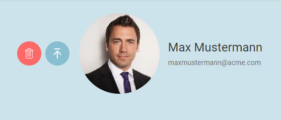
The My Profile section displays personal contact information for the logged-in user and their allocated places in the office and parking buildings. This information is only visible to the user itself. Users also have the possibility to edit some of this information, the editable information being:
- city
- office building
- department
- default time interval for Check-Ins

Depending on the device, the section for updating the profile photo can be found either on the top of the Manage Profile and Settings sections (on desktop) or on the Manage Profile section (on mobile).
In case there is an place allocation available, the information regarding which place has been assigned to the user will be also available under this section - Manage Profile - Allocated workplace/ parking place. This is not an editable section.
Notifications
The notifications section offers the possibility to see all notifications in the app so that the users can have a history of what was happening in the app since their last visit. The notifications are accessible by clicking the bell icon in the top right corner.
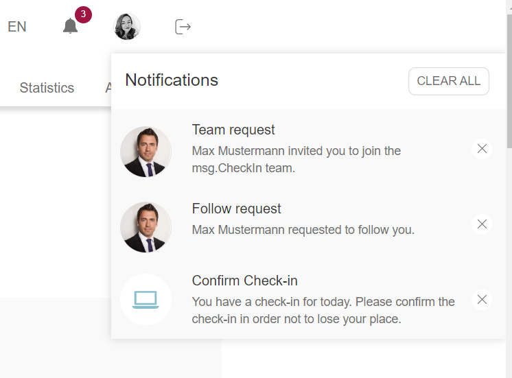
The list with notifications will be kept for one month. The notifications appear in the list in descending chronological order, meaning the first item in the list is the newest one. The not read (clicked-on) notifications will have a darker grey background than the notifications on which the user already clicked. By clicking on a notification the user will be redirected to the corresponding page inside the app where an action related to the notification can be taken. The notifications can be cleared individually by using the "x" button on each notification or all at once by using the "Clear All" button.
Workplace Management
The users who have the role Building Admin/Allocation Admin have access to an additional menu feature, Workplace Management, where the entire building management can be done. In case the user only has the allocation admin role, this feature is visible in case they were named as admins for at least one enabled zone. When accessing this menu item, all buildings which are managed by the admin are displayed. Depending on the activation of the Parking functionality by the System Administrator, one or two tabs are available: one for Office Buildings and one for Parkings. All the functionalities applied for office buildings are available for Parkings too.

In order to fully model a facility in the application, the following hierarchy has been designed:
- Building
- Floor
- Zone / Office
- Workplace / Parking Space
Add building information
By pressing the "+Add Office/+Add Parking" button, the process of adding a new facility to the application is started. The page that opens contains three menu items (Office/Parking Details, Equipment, Floors), but initially, only the one with the building details is available for access. Depending on the case, the fourth menu will be available, namely the one dedicated to the allocation of seats.
For a building, the following information can be added:
- Name of the building
- City where the building is located
- Status - draft or public, depending if the building is fully configured or not. Draft means that the building is not yet visible for the end-user
- Address of the building
- Admins – by default the name of the creator will appear here. There is also the possibility to add more people as admins by simply typing their names and adding them to the list.
- Photo – suggestive photo with the building
- Check-in confirmation - by enabling this feature, all users will be required to confirm all their office check-ins in order not to lose their workplace. If the box is not checked, all check-ins will be automatically validated by the system. The confirmation can be done up to half an hour after the check-in’s starting time
- Recurrent Check-in: is automatically turned on for all buildings in the application, whether they are newly created or already existing. If you wish to turn this feature off, you can disable the flag, which will remove the "Recurrent" button from the Check-In menu tab. When this happens, users will only be able to make day-by-day bookings and will no longer be able to create recurrent check-ins.
- Check-in date offset (in weeks) - the building admin can set the maximum number of weeks in the future up to which an employee is allowed to create a check-in. For e.g, if the written amount is 4, then users may perform a check-in for a maximum of a month in the future. The maximum possible amount which can be written is 53 weeks, meaning a year in the future
- Check-in duration (in hours) - the building admin has the possibility to set the length in hours of a single check-in. He/she can either set a normal 8 hours workday or give other values which must be greater than 1 and smaller than 24
- Building Info: building admins have now the possibility to add information about buildings, in the form of "house rules", who can be helpful for users. In case a building has that information available then an "i" symbol will appear on each building card to symbolize the existence of this feature. In this text box, the admin can write plain text or add links to other webpages
- Time zone - is configurable for each office building and will determine the exact time zone in which all check-ins will be done

After pressing the Save button, the new building is stored in the application and the other menu items become available.
The same fields and steps apply to the process of creating a Parking space except for the Confirmation functionality which doesn't apply to this kind of buildings.
Add equipment to the building
The second step in the building creation process is the one dedicated to creating the Equipment. The building admin can add, edit or delete equipment.
The following details can be added for equipment:
- Name
- Description
- Icon - the most appropriate icon describing the equipment
- Standard equipment - if the configuration is set, the equipment is pre-selected for every place in the building

By clicking Save the new equipment is being created and added to the list of building equipment. In order for the building admin to add more items, he/she must click on ADD EQUIPMENT button and restart the equipment creation process.
The same process applies in the case of Parking Spaces if the Building Admin wants to add special equipment (e.g. Electric charging station).
Add floors to the building
The third menu item allows the management of the floor / zone / place hierarchy.
The process starts by adding floors to the building. The building admin can enter the following information: Floor Name, Level, and a Plan for the entire floor. After entering the desired information, the floorplan can be saved by pressing the Save button. All three field are mandatory.

Add zones to the floorplan
One floor can be divided into several Zones / Offices. This additional step makes it easier for the user to better see the workplace / office information on mobile devices. A Zone should be thought of as the lowest level at which a user should navigate in order to be able to easily book a place. It can be also considered as being an office room if desired. To add a new Zone, just press on the newly created floor, wherever you want to position the zone.
In order to create a new zone, the building admin should select the type of the zone (Free/Allocated), add a name for the zone, decide whether the zone is Enabled/Disabled and upload the zone’s plan (picture format). The Enabled option means that the zone will be visible for the end user. The Allocated option, when activated, requires a list of allocation admins, containing the persons who will take the responsibility for the upcoming allocations. Also, when a zone is allocated, each new place created under it will have, by default, the status set to Allocated. For an allocated zone, the building admin has the possibility to choose a color by entering a HEX code or by simply selecting from the suggested color palette and all the places created in that zone will inherit the chosen color (green is the default color if no color is chosen for an allocated zone).
Additionally, a zone can be assigned exclusively to a specific team, ensuring that only team members can create check-ins for the designated places within that zone. To assign a zone to a team, the building administrator can search for the desired team by its name. Keep in mind that all created teams within the entire company will appear in the search results, so it's important to select the correct one. Zones with an existing team allocation will no longer be visible in the Manage Allocation section, as the allocation has already been completed.

After clicking on the Save button, the building admin can see the locked symbol (key symbol) and the chosen color, in case it is an allocated zone, or the green colored pin, in case it is a free zone, followed by the zone name. The building admin has the possibility to edit/delete a zone as well.
In order to reposition this Zone as a pin on the Floorplan (this will be used as the clickable item for the users to navigate to this level), press the ARRANGE PINS button on the top-right corner of the Floorplan. This transforms the view in an Edit mode where the building admin can simply move the pin, with Drag and Drop, to the desired location. Click on the same button, which now is called SAVE PINS POSITION to keep your settings as displayed in the example below:

Add places to zones
Once the zones have been created, the building admin can proceed with adding places to the map. In order to do that, a few steps need be followed.
The building admin should click on the selected zone, wherever they want to position the place. In the opened pop-up, the building admin can see the zone/department name, color, and the locked symbol, in case it is allocated. In the first section, the building admin can choose whether they want to create a free or an allocated place. They can create free spaces under allocated zones and allocated places under free zones, the default status of the places being inherited from the zone level. The building admin can also assign a place number and specify the name of the zone (room name) in which the place is being created. The room name/ number is associated with a place and therefore must be typed each time a new place is created or when an already created place is edited.
Furthermore, place numbers within a single zone do not need to be unique. This means that there can be multiple places sharing the same number, such as two or three places with identical numbering.
In the second section, the building admin should choose the type of the place they want to create: workplace, cafeteria or recreation. Cafeteria and recreation places cannot be allocated to employees. A new place can have the following properties enabled/disabled, enabled meaning that it will be visible to the end user. The People with disabilities control marks a place as a special place for people with disabilities. By enabling this control, the end-users will see a pin with the wheelchair symbol, which symbolizes the fact that the place must only be occupied by people with special needs.
The building admin can also specify the equipment for the newly created place. The standard equipment is initially pre-selected, but the selection can be modified both by removing standard equipment and by adding other equipment.

For the parking places, the building admin has the possibility to choose either a normal parking place, one with electric charging, or one for guests (a place for non-employees). In the case of selecting the electric charging place type, the building admin can specify the socket types available for that place.

Pressing the ADD button will create the place. The building admin can also edit/delete the created place by simply clicking on it.
If you want to reposition the workplace press the ARRANGE PINS button on the top-right corner of the Zone plan. This transforms the view into an Edit mode where the building admin can simply move the pin, with Drag and Drop, to the desired location. Click on the same button, which now is called SAVE PINS POSITION to keep your settings as displayed in the example below:

Repeat the above steps for adding any number of workplaces to the map.
Please make sure that at least one place was created before making the building public to the employees. Otherwise, that floor/zone won't be visible to the end user as it doesn't contain any bookable places.
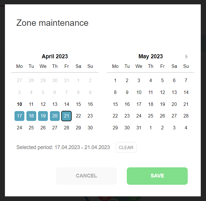
Zone Maintenance Schedule
In the event that a zone becomes temporarily unavailable, there is a useful feature that allows you to schedule maintenance for a specific period of time. This can be done via the "Maintenance" button, located in the Administration view of the zone. Upon clicking this button, a pop-up window will appear containing a date interval selector. You can then select the start and end dates of the scheduled maintenance period. Once the date range has been selected, it will appear below the section displaying the months, and a "Clear" option will be available for resetting the maintenance interval.
Please note that setting up a maintenance schedule will result in the deletion of all check-ins, including event registrations, that overlap with the selected date range, and users will be duly notified of this. Furthermore, it is important to bear in mind that during the maintenance period, check-ins will not be possible in the affected zone.

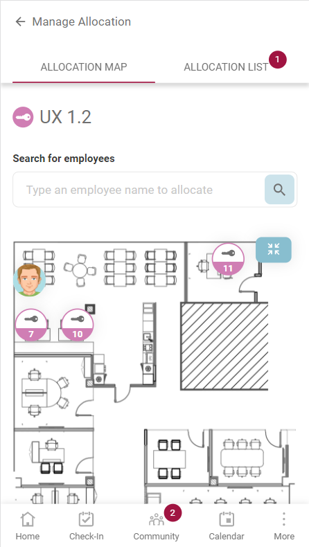
Manage Allocation
The Manage Allocation tab is visible to the users who have the Allocation Admin role for at least one zone in a building. Under the tab, all the buildings in which they are allocation admins are displayed. By clicking on a building’s Manage Allocation tab, a list with all the floors which contain at least one allocated zone is shown. When choosing a floor, the allocation admin can see the zones which were assigned to them and after clicking on a zone, the admin navigates to a view where the allocation process can start.
On the right side of the view, the allocation admin can see the zone map with the locked seat pins and the already allocated places. On the left side, there is a search field, where the admin can search for employees to allocate. There is also the Allocation List, which contains all the allocations made in that zone. An employee can have a maximum number of two allocated places, one for an office building and one for a parking building. The Allocation List can be downloaded in the form of a csv file by clicking on the Download list button.

There are 2 ways in which the allocation admin can allocate a place to an employee: they firstly click on a locked pin and then search for an employee in the search field, or they firstly search for an employee and then click on the desired pin. After the place was allocated to an employee, a new card is added under the Allocation List and the employee’s picture is visible on the floor map. Additionally, the employee is notified of this allocation by email and can see their allocated places in My Profile section.
The deallocation mechanism is bidirectional too. The allocation admin can click on the delete symbol attached to each card from the Allocation List or just click on the corresponding pin from the zone map. After an employee’s allocation is removed, the employee is notified by email.
On mobile, the information is visible under two tabs: Allocation Map and Allocation List. After an employee was allocated to a place in the Allocation Map, their name will be visible under the Allocation List. A bullet is visible next to the second tab's name, showing each time the number of added employees.
Manage Check-Ins
The Manage Check-Ins menu enables the building administrator to remove check-ins for employees/guests who are absent due to personal/medical reasons, freeing up the space for booking. The default display shows today's confirmed and pending check-ins for all employees, but the admin can search by employee name and browse the calendar day-by-day.
The list of users displayed contains all the check-in details and a delete button. When clicked, a pop-up appears to prompt the administrator to specify the reason for deletion (if the selected check-in is not for a guest). The typing of a reason is mandatory. After the deletion is successful, a notification is sent to the user and a success toaster appears.

Edit an existing building
All information added by the building admin when creating a new location can be edited. This option is available on any of the levels mentioned in section Add a new building. Entering the Edit mode allows the building admin to change all the properties that he/she has previously set while creating the new location, including name, address, images, pins location. To access these options, press the Setup button and start modifying the information under Office Details section and then press the Save button in order to modify the building . For Equipment and Floor section there is an dedicated Edit button/symbol which needs to be pressed in order to enter the edit mode. Press Cancel to reset your changes. The same process applies to Parking Spaces.
Remove floorplans
All information added by the building admin when creating a new location can be deleted. This option is available for any of the building levels mentioned in section Add a new building. Entering the Edit mode and pressing the Delete button, or simply pressing the Delete button attached to each building card, allows the building admin to remove the corresponding level information. The same process applies to Parking Spaces.
Check-in using a QR code
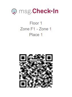
Building administrators are able to produce Place Stickers tailored for the physical desks located within the premises. These place stickers comprehensively encompass details concerning the specific place's whereabouts, encompassing essential information such as building, floor, zone, room names, and the place number. Beyond these location particulars, the place sticker is enriched with a QR code. This QR code serves as a convenient means to swiftly initiate the check-in process through effortless scanning, enhancing user efficiency.
This introduces a seamless check-in option for employees, facilitated by scanning the QR codes featured on these stickers. The utility of this feature spans across diverse place categories, encompassing offices, parking lots, cafeterias, recreational areas, and allocated places. Building administrators exercise full discretion in choosing the specific places for which QR code stickers are to be produced.
Building administrators should remain mindful that any adjustments to the physical building layout, such as desk relocation or removal, mandate the issuance and substitution of QR code stickers. Equally important, in instances where a place pin is removed from the app, the corresponding physical sticker must be promptly removed from its designated location. This proactive measure is indispensable in averting any inconvenience for employees who might otherwise encounter error messages when endeavoring to scan a QR code that no longer corresponds to an active place pin.
How to get the Place Stickers from the app:
- There is the option to obtain all the QR codes from a zone by clicking the “Download all QR codes” button located under Workplace Management - Zone Edit. This will open a new window (browser's printing menu) where all stickers all present and can be immediately printed or saved as pdf file:


-
Another option is to print the sticker for each particular place. In this case the building admin need to click on a place pin, enter the edit pop-up screen, and then use the “Download QR code” button in the upper right corner:

Optimal Approach for Place Sticker Printing
For the most efficient and professional results, we strongly advise utilizing the services of a print shop for the printing of QR codes. Print shops offer specialized papers designed for seamless adherence to surfaces. To further enhance usability during the printing process, each sticker is thoughtfully outlined with a distinct grey border. This delineation assists print house personnel in employing a guillotine for effortless and precise sticker cutting. By leveraging the expertise and tools available at a print shop, you can ensure the production of high-quality, accurately crafted QR code stickers.
Statistics
This functionality is available only if your System Administrator enables it.
At the top of the page, the user first has to select the building for which he/she wants to see the reports and afterwards the time interval. By default, the selected period is the last two weeks, but it can be changed by clicking on a predefined time interval in the menu from the past or from the future, or by selecting a custom range of days in the calendar. In both cases, the user must click on the Apply button to make the change or on the Cancel button to return to the previous configuration. The Printer button right next to the time interval allows the user to print the entire layout of the reporting page.
Each of the displayed report contains in the upper right corner a download button that will enable the user to obtain an excel file with all the data displayed in the graphics.

The following charts are available:
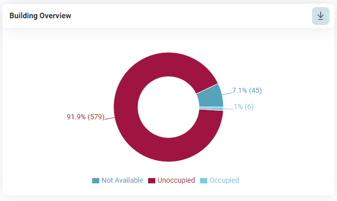
Building Overview
An overview of enabled/ disabled and occupied places in a specific building. The chart refers to the total number of unique places during the selected time period.
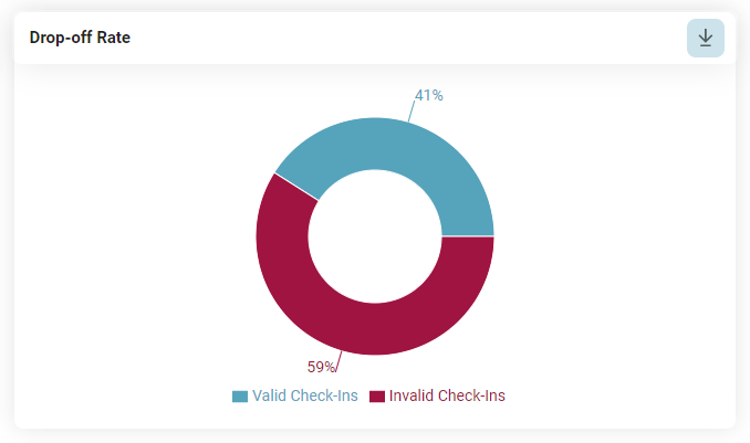
Drop-Off Rate
The chart shows the difference between the number of validated check-ins and the total number of created check-ins on building level. It becomes relevant in case the "Confirmation" functionality is being used, otherwise the valid check-ins will represent 100%.
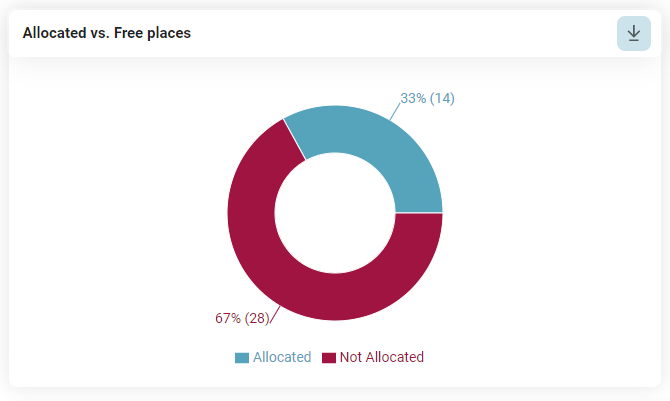
Allocation overview
The chart displays the ratio between the number of allocated places and free places in the building. This statistic is relevant in case allocated places were modelled by the building admin.
Overview of Places
An overview of the enabled, disabled, and occupied places of a particular floor or zone. The data is being displayed based on the validated check-ins:

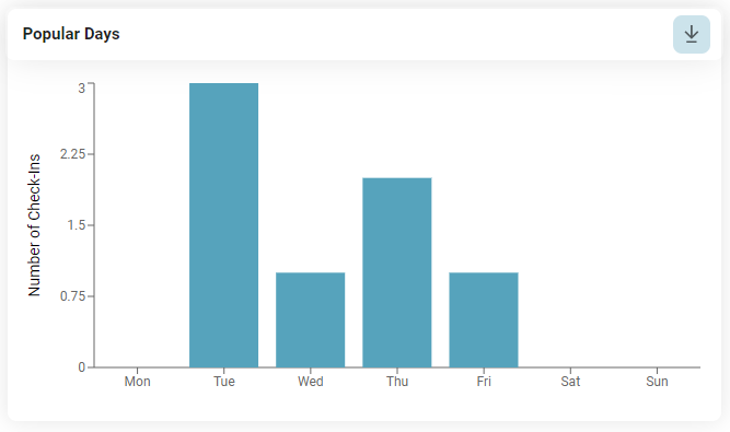
Popular Days
The chart aggregates the data regarding validated check-ins to display the days in which employees come more often to the office.
Duration of Check-Ins
An overview of the duration of the check-ins. This chart will help the company identify the most/least popular durations for which the employees perform a check-in. The bars of the chart are divided into 2 sections: one showing the number of created check-ins and the other one the number of validated check-ins for the entire number of check-ins created with that duration.

Evolution of Check-ins
In this chart the user can see the number of validated check-ins over time for a particular zone or floor:

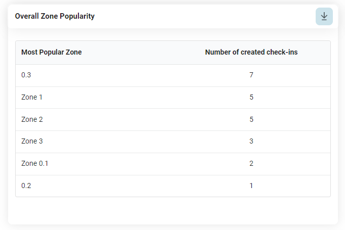
Overall Zone Popularity
In this chart the user can see which are the most popular zones of the selected building, taking into consideration the validated check-ins. The first 6 most popular zones are being displayed in the table:
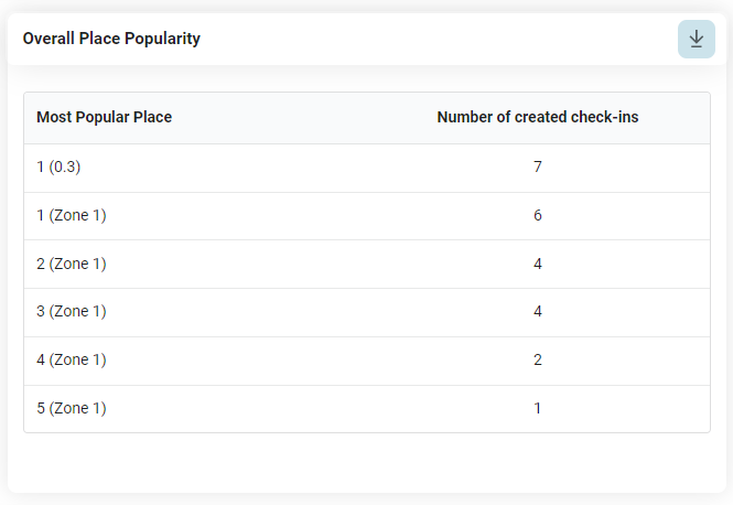
Overall Place Popularity
In this chart the user can see which are the most popular places of the selected building, taking into consideration the validated check-ins. The first 6 most popular places are being displayed in the table:
Peak Hours
Here it can be seen the time interval during which the employees go to the office, taking into consideration the validated check-ins:

Other Reports
Depending on the User Role, the application allows the extraction of other reports: daily occupancy report and monthly occupancy report. The reports are based on the validated check-ins.

Daily Usage Report
This report is available for the user who has the building admin role (see User Role) for the selected building. The purpose of this report is to provide anonymized information about the workplaces that were used today, to serve as information for Facility management or cleaning services.
The report is currently available in .csv format and is accessible by pressing the Download button. The following information is contained in this report:
- Date
- Building
- Floor
- Room
- Workplace
No user information is available in this report.
Historical Building Usage
This report is available only to the Reporting admin (see User Role) and contains information regarding all check-ins performed in the corresponding building for the time interval that was set by your System Administrator. By pressing the Download button, a .csv report is generated with the following information:
- Date
- Start and end time
- Name
- Building
- Floor
- Room
- Workplace
- Type of workplace (Allocated or Not Allocated)
This report contains also user information, such as Name and Email, as its purpose is to allow the traceability of persons in the offices in the current context of the Covid-19 pandemic (provides valuable input in case of epidemiologic inquiry).
Event Management
Events are an important feature that enables users with the special role of "Event Planner" to schedule and manage activities within a building or in an external location. When establishing an event, the user should consider the following basic information:
- Events have the highest priority among all other types of check-ins. When an event is created, all existing check-ins in the selected rooms and floors will be deleted, and users will be notified of this action.
- An event can take place in a single building but can extend across multiple floors and rooms.
- Events can be planned also outside of the company buildings, in other locations that do not require seat plans.
- Events can be scheduled for a maximum time interval of 24 hours. If the same event occurs on multiple days, the original event with all attached information can be duplicated for subsequent dates.
- Multiple admins can be designated to help manage the event. Only users with the role of "Event planner" can create and manage events.
- Event planners can opt for ticket generation process for their events, meaning that each registered user will receive an individual ticket with a QR code, which must be validated to participate to the event.
- Events can be designated as public, allowing anyone in the company to register, or private, requiring users to be on the guest list to register.
- Events can be activated, allowing users to see and register for the event, or they can be inactive, meaning they are still in draft mode and not visible to others.
- Event planners can choose the target group which will be notified about the new event so that only those who need to know about the upcoming event, actually receive the announcement.
Manage Events - Event Planner view
Users with the role of Event Planner have access to a dropdown on the Events feature tab. By accessing the Manage Events tab, the Upcoming Events will be displayed in the form of cards with the most relevant details attached. In addition to the details, shortcut buttons can be found on the card for actions like edit, activate/deactivate, and delete. In the top left corner of the page, beneath the menu, a navigation tab component allows the user to access the Past Events page. This page represents an archive of all the past events from the company in the same form of cards with details but without any shortcut buttons and actions possible. Past events cannot be deleted and can only be viewed for details.

Clicking on an event card reveals a preview page with basic and essential information about the event, such as:
- Event name
- Event picture
- Date
- Time interval (based on the building's local time)
- Building name
- Selected floors
- Selected zones
- Recommended participant count (calculated from available spaces in the selected zones)
- Event description
- Confirmed participant count (number of people already registered for the event)
- Option to download a CSV file containing the list of registered participants
- Notification type
- List of event admins
- Event type (private or public)
- Guest list (if the event is set to Private).
The lower right section of the window also features the action buttons from the initial card for the user's convenience, should they wish to make changes from the preview page.

Add a new event
By pressing the +Add Event button, the creation event flow is started. This process consists of three steps: providing details, specifying the location, and publishing.
In the first step, the user must enter the date, time, title, and description of the event. Optional fields include a subtitle and a photo. By default, the current event planner appears in the event admins section, but additional admins can be added by selecting names from the dropdown menu. Users can upload a photo using the file system search or drag-and-drop option. Events can only be created for the present or future dates.
Event planners have the flexibility to create events that require ticket validation. To enable this functionality the "Generate Ticket" option must be checked when setting up the event. This will ensure that attendees are required to present a valid ticket for entry.
Once all required fields are completed, the "Next" button becomes active, allowing the user to proceed to the second step of event creation.

The second step represents the location selection. The event planner has the option to either choose an existing building or to create the event in another location, outside the company. By default, the option "Office Buildings" is selected, meaning the possibility to create an event within an existing office facility. The dropdown menu also offers the choice of an "Other Location" event type.

1. Office buildings
If multiple buildings are available, then the selection will start at the building level. An event planner can choose a building and then select which floors and/or zones he/she wishes to book for the event. If the event planner desires to book the entire building, he/she can simply click on the Select Entire Building button, located in the upper left corner of the selected building card. The "Back to buildings" button allows the user to return to the building selection level.

This step is especially important in the event creation process because events cannot overlap for the same date, time, and location. If buildings, floors, or rooms are already booked for the specified details, the user will receive pop-up notifications or warning messages indicating that booking is not possible:
- In case the entire building is already booked:

- In case one or more entire floors are already booked:

- In case of particular zones are already booked:

2. Other location:
Users can also organize events outside company facilities in locations without building plans. To do this, after selecting the "Other location" option from the dropdown menu on step two, the user must enter the venue's maximum participant capacity, time zone, and an exact address. As there are no more plans and seats available, the application cannot calculate the maximum number of participants, so the user is responsible for determining the limit. Once the maximum number of registration is reached, others will no longer have the option to register for that event.
For the address field, it is advisable to limit the number of rows to a maximum of 5. This restriction ensures that the text entered does not affect the layout and generation of the ticket.
All three fields are mandatory fields and must be filled by the event planner in order to navigate to the third step.

The third step includes a brief preview section followed by a small part of the final configuration. In the configuration section, the event planner can customize the events depending on the needs:
- An event can be designated as public, open to everyone, or as private, restricted to a specific guest list
- An event can be saved as active, meaning they are visible or inactive (draft mode), in case editing is still required
- Notifications for new event announcements can be configured to be sent to all employees, by location, or not sent at all
Once the event is configured as desired, the user can press the "Publish" button to create the event.

Possible use cases when choosing the event type under step three:
- Private events: These events are intended for situations where only a specific target group should have visibility and access. Examples include workshops for specific individuals, client visits with limited employee involvement, training sessions for certain groups, or any other occasion not meant for all employees.
- Public events: Created to be visible and announced to the entire company, these events encompass occasions such as office parties held within the building or other locations, or any large-scale event where the target audience is not a small, guest-listed group, but rather the entire organization.
Edit Event
The event editing process follows the same steps as event creation. The existing event data can be modified as needed. Event planners must carefully change the date, time, and location to ensure the event fits into an available slot not already booked by another event. All event details can be altered, except for the event type (public events cannot be changed to private and vice versa) and the ticket generation checkbox (once an event requires ticket validation, this option cannot be changed and vice versa).
Delete Event
To remove an event from the upcoming event page, event planners can use the shortcut bin button on the card or press the "Delete" button on the specific event's preview page. Upon deletion, a modal appears requesting the reason for the event's removal. Providing a reason is mandatory, as it will be included in notifications sent to all users who have checked in to the event, informing them of the event's deletion.

Deactivate Event
Deactivating an event erases all existing registrations, and users will be notified accordingly. After deactivation, the event will no longer be visible to end users but will remain accessible to the event planner. If there is a possibility that the event may occur at a later date, it is better to deactivate rather than delete it, as all data about the event remains saved.

Scan QR
For events that generate tickets, an additional action called "Scan QR" is available on the preview page of the event. By clicking on this action, the event planner can initiate the scanning process for the tickets.
During the scanning process, if the ticket validation is successful, a popup message or a drawer (on mobile devices) will appear to indicate the successful validation. This feedback confirms that the ticket is valid and can be used for entry.
However, if the ticket validation is unsuccessful, the popup or drawer will display an appropriate message to inform the event planner about the issue.
The event planner can repeat this process until all tickets have been successfully validated.
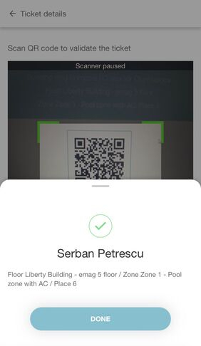
To provide event planners with a comprehensive overview of participants and track the variance between booked places and validated tickets, the event planners have the option to download a CSV file containing this information. This section is called Participant List and is located on the Preview page of the event.
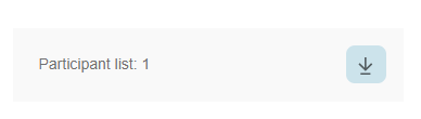
Duplicate event
The duplicate event option assists event planners who need to replicate an event for multiple days. All information stays the same, with the only required change being the date. After selecting a new date, the event planner simply presses the "Next" buttons, and in step three, the "Publish" button.

View Events - End User view
Under the Events Tab, users can view upcoming events displayed as cards. Each card showcases essential event details, such as title, date, time, and location. A toggle button in the top left corner allows users to filter events by location or view all available events.

If you want to see more information about a particular event, you can click on the card to open it. Here, you'll find information about the recommended number of participants, a detailed description of the event, and any other important information.
Clicking on a card provides additional information, including the recommended number of participants and a comprehensive event description. To register for an event, users can click the Register shortcut button on the card or the details displayed, leading to the Event Details page. This page contains essential event information and a Select a Place to check-in section, where users can navigate the building and register on a place in the same manner as office check-ins.

Upon selecting a free place, the Register button is enabled, and when pressed, the user is redirected to a Summary page. After confirming the details, users can check in and proceed with the parking check-in flow (if available).

For events outside company buildings, users do not need to choose a place from a zone map. Instead, clicking the Register button secures their spot at the event.

After registering for an event, the entry appears in the user's personal calendar, alongside available actions such as unregistering, returning to the event details page, and adding a parking spot (if not done during registration). A special event icon differentiates the event from regular office check-ins in the user's personal calendar section.

Upon completing the registration process, if the event requires ticket generation, on the Calendar page the users will have access to the generated QR code specifically for the event. Additionally, users will have the option to download their ticket by clicking on the "Download ticket" button. This allows them to conveniently obtain a digital copy of their ticket for future reference or printing if needed.

The ticket is a A4 PDF file, which contains the event details and the unique QR code. Please make sure to present it at the entrance of the event to be validated by the event planners.
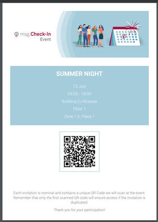
Registrations are visible on the home page of the application and under the "Events" tab. Events with registrations are listed first in the list of available events for easy access. To unregister from an event, users can click the "Unregister" button on the event card or access the detailed view for more actions. The type of button present on the event card also shows to the end user, the events at which a registration already exists, but also the events where a registration is pending and the "Register" button is still present.

When an event reaches maximum capacity and no subscriptions are available anymore, the "Fully booked" status is displayed on the card under the View Events section, indicating that no more registrations are possible.

The events feature also impacts the office check-in flow. Users cannot create office check-ins in buildings, floors, or zones reserved for events, and warning messages will appear. Users can either choose another building/floor or zone or register for the event by clicking the "Go to Events" button.
- If an entire building is booked by an event:

- If an entire floor is booked by event:
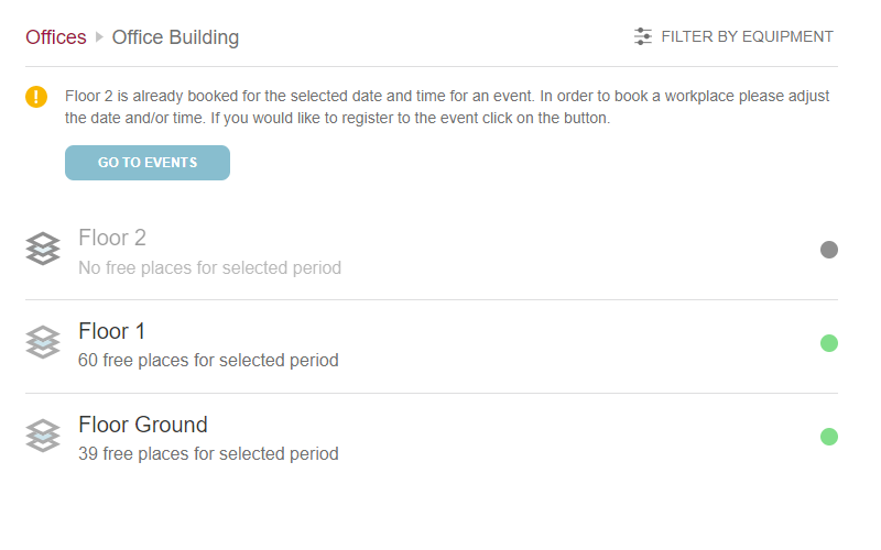
- If some of the zones are booked for an event:

